Let’s dive straight into the heart of revamping your digital presence with a **website redesign template**. Revitalizing your website goes beyond a mere aesthetic update; it’s about thoughtfully improving the user journey, embedding SEO principles from the start, and carefully orchestrating each step for triumph. As we navigate this path, you’ll discover that harnessing analytics becomes a pivotal guide in crafting decisions rooted in data that echo with your intended audience. Additionally, we’ll delve into reshaping your content approach to not just draw in but also mesmerize and persuade your audience. Ready for a transformation? Hang tight while we dive into revealing these insights, guiding you through a journey of transformation and discovery.
Table of Contents:
- The Role of User Experience in Website Redesign
- Integrating SEO Best Practices in Redesign
- Effective Project Planning for Website Redesign
- Leveraging Analytics for Data-Driven Decisions
- Content Strategy Reinvention
- Conclusion
The Role of User Experience in Website Redesign
When it comes to a website redesign, the spotlight shines bright on user experience (UX). It’s not just about slapping on a fresh coat of paint. Consider UX as the architectural plan for crafting a home that beckons to all, inviting them to stay. A site’s design might catch your eye, but its UX decides if you’ll stay for dinner or bolt out the door.

Prioritizing Mobile-Friendly Design
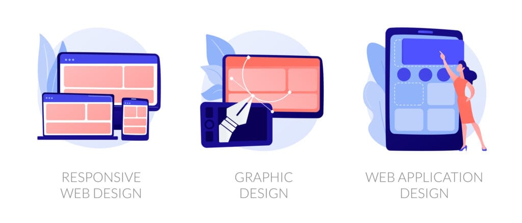
In today’s digital age, ignoring mobile users is like opening a water park in the desert—pretty pointless. With mobile traffic accounting for roughly 50% of web activity globally, having a responsive design isn’t optional; it’s critical. This shift towards mobile-first indexing by Google underscores the importance of ensuring your site plays nice with smartphones and tablets alike.
A responsive layout adapts seamlessly across devices, promising an inviting experience whether viewed on a cramped smartphone screen or sprawling desktop monitor. The aim here is clear: keep those thumbs scrolling and taps coming without frustration or zooming gymnastics required from users.
Enhancing User Interaction

User interaction goes beyond clicking buttons—it’s about feeling at home while navigating through pages and finding exactly what you’re looking for with ease. Options to boost this experience might encompass user-friendly dropdowns, compelling invitations to act, and neatly organized sections of text that warmly welcome visitors deeper into your realm.
Leveraging tools such as usability testing lets you peek over your audience’s shoulder (figuratively speaking) to see how they interact with your current site before diving headfirst into redesign plans. You’ll learn where users get stuck and which paths they prefer to travel down—insights invaluable when sculpting an environment tailored specifically to their needs.
Remember those stats throwing around big numbers? Here’s one more: 75% of folks judge credibility based on website design alone—a figure impossible to ignore if establishing trust is high up on your agenda. Usability testing, therefore, isn’t just helpful; it’s essential in painting every corner of your online presence with confidence-inducing strokes designed expressly for target audiences identified within customer profiles generated from data-driven insights.
Moving forward with these principles guiding our compass ensures we’re not just making websites look pretty—we’re crafting experiences that resonate deeply because they were built upon understanding real people behind screens searching earnestly among millions online spaces seeking solutions fit perfectly like the last piece of a puzzle falling into place effortlessly. Together, let’s embark on a quest to craft something extraordinary, blending our creativity and insights.
Integrating SEO Best Practices in Redesign
When you’re diving into a website redesign, it’s like giving your digital presence a fresh coat of paint. But, let’s not forget the structure beneath. Starting with search engine optimization (SEO) early on guarantees that the revamped appearance isn’t merely for show but also effectively attracts and engages visitors.
Prioritizing Mobile-Friendly Design
In today’s world, if your site can’t perform on smartphones, you’re waving goodbye to half of your potential traffic. Google has shifted its algorithms to favor mobile-first indexing because roughly 50% of global web traffic comes from mobile devices. This means ensuring responsive design isn’t just nice-to-have; it’s essential for keeping up with both user preferences and search engine demands.
A website that seamlessly morphs to fit various gadgets not only enriches the visitor’s journey but also encourages them to immerse more fully in what you have to share. Remember, when users enjoy their visit, so do the search engines.
Enhancing User Interaction
User interaction goes beyond clicking buttons or navigating menus—it encompasses everything from how quickly pages load to how easy information is to find. Implementing features that improve these interactions can significantly impact how visitors perceive your site.
A closer examination of analytics could unearth unexpected insights into user behavior on your site, contrasting sharply with initial expectations. Tailoring design elements based on real data helps tailor experiences specifically suited for your audience—making them feel right at home.
The Importance of Organic Search Growth
We all know being on the first page of Google is akin to striking gold in the digital era—with websites there receiving 95% of web traffic according to recent stats—but getting there isn’t by chance; it requires strategic planning and execution throughout every phase of a redesign project including keyword research through avoiding keyword cannibalization as explained by Ahrefs.
This meticulous approach extends beyond keywords alone; optimizing meta tags, improving page speeds, and creating high-quality backlinks are equally crucial steps towards enhancing organic reach—a task easier said than done but undeniably rewarding once achieved. Incorporating SEO best practices early ensures each aspect of the redesigned website works harmoniously towards achieving greater visibility online. So yes, the beauty lies not only in aesthetics but also within well-structured code and thoughtfully placed keywords—all playing their part in elevating one’s position among internet giants.
So, keep in mind that integrating SEO from the start isn’t just about drawing attention. It’s a powerful move to ensure your business thrives online well beyond the initial excitement of launching your revamped site.
Effective Project Planning for Website Redesign
Imagine launching a website redesign project only to find out halfway through that your timeline is unrealistic, resources are overstretched, and the end goal seems further away than when you started. This scenario is more common than you might think, with only 64% of projects meeting their goals due to poor planning and communication issues. But don’t worry; armed with the right project plan template and an understanding of business goals, this doesn’t have to be your story.

Prioritizing Your Business Goals
The first step in any successful redesign project plan involves sitting down with team members to outline clear business goals. Is boosting your site’s visibility through more search traffic what you’re striving for? Do you want lower bounce rates or higher goal completions? Knowing what success looks like enables everyone involved in the design project from web designers to content creators – to align their efforts towards these objectives.
A solid foundation also helps tailor strategies such as engine optimization or improving user behavior on-site which directly impacts how well your site performs on search engines. Moreover, it simplifies the process of pinpointing deficiencies in website content or aesthetic features.
Crafting a Detailed Project Plan Template
With business goals pinned down, crafting a comprehensive redesign project plan becomes crucial. A detailed template not only outlines tasks but assigns responsibilities across team members ensuring every aspect of the website revamp gets attention it deserves—from initial SEO auditing all way through development phases up until live launch day.
This blueprint serves as a beacon, streamlining schedules and balancing workloads to prevent any segment from overshadowing the rest, thereby dodging delays and reducing tension among the team. Moreover, having this document shared among stakeholders ensures expectations remain aligned and avoids miscommunication pitfalls commonly seen during complex projects like these.
Leveraging Analytics for Informed Decisions
An often-overlooked component within many website redesign plans is leveraging analytics data to make informed decisions about the direction the new site should take. For instance, by analyzing current search traffic trends using tools like Google Analytics, you can reveal invaluable insights into what users are looking for most, which pages are driving conversions, and where potential content gaps exist that need addressing to ensure a smooth transition between the old and new versions of the company’s professional web presence.
Incorporating findings from the analysis phase early allows you to adjust course as needed based on real user feedback rather than making assumptions that could potentially derail the entire effort in later stages. Especially considering the fact that websites on the first page receive upwards of 95% of total clicks—highlighting the importance of getting things right from the outset if you aim to capture a larger share of web traffic. Making sure your strategies align with actual user behaviors and preferences is crucial for climbing up those search rankings and securing your spot on that coveted first page.
Leveraging Analytics for Data-Driven Decisions

Imagine steering a ship through foggy waters without a compass. That’s what attempting to redesign your website without leveraging analytics feels like. Utilizing tools like Google Analytics can shine a light on user behavior, guiding you toward informed decisions throughout the redesign process.
Analyzing Search Traffic Trends
Grasping the way in which guests discover and engage with your webpage is of paramount importance. Delving into search traffic patterns reveals the allure of your content to viewers and highlights potential voids in your approach. This knowledge not only informs the design choices but also shapes an effective content strategy that resonates with users.
Bounce rates aren’t merely digits; they narrate the tale of user contentment or its absence, painting a vivid picture of engagement levels. Consider this: bounce rates can skyrocket by 50% if it takes two extra seconds for your website to load. These stats underscore the importance of speed optimization during any site revamp effort.
A conversion rate isn’t just another metric—it’s the heartbeat of your online presence. Grasping which sections of your website have the highest conversion rates enables you to emulate those victories in different parts, making sure each interaction a visitor has contributes meaningfully towards hitting those crucial objectives.
The power of data-driven decision-making becomes evident when looking at successful websites—they don’t guess; they know because their strategies are rooted in solid analytics foundations like avoiding keyword cannibalization, which ensures each page serves its unique purpose without competing against others on their own site for search engine attention.
Digging deeper into Google Analytics reveals patterns that could easily go unnoticed but have significant impacts on engagement and retention rates—details such as which devices most visitors use or specific countries they come from help tailor everything from layout adjustments to localization efforts, making sure no potential customer feels left out or overlooked because their experience wasn’t optimized for them specifically.
In essence, diving into analytics before embarking on a website redesign project plan is akin to mapping out treasure locations before setting sail—you’ll have clear targets rather than aimlessly wandering the vast ocean hoping to stumble upon success randomly.
Remembering key statistics along this journey will serve as guideposts: knowing sites occupying Google’s first-page gain 95% web traffic highlights why SEO needs integration right from start—not an afterthought post-launch—a fundamental step towards organic growth in visibility amidst digital sea monsters vying for the same treasures (or customers).
Content Strategy Reinvention
Revamping your content strategy is like giving your website a new engine. It’s not just about the shiny exterior; it’s what’s under the hood that counts. With over three times as many leads generated by content marketing compared to outbound marketing, and at 62% less cost, it’s clear why this aspect cannot be overlooked.

Prioritizing Mobile-Friendly Design
In today’s digital age, having a mobile-friendly design is no longer optional. Google has adapted to this trend with its mobile-first index, making responsive design crucial for any site looking to improve or maintain its search ranking. This move reflects user behavior too—mobile accounts for approximately 50% of web traffic globally.
A mobile-responsive site ensures that regardless of the device, users have an optimal viewing experience—crucial when you consider that 75% of users judge a company’s credibility based on its website design. By weaving a mobile-compatible design into your site’s revamp, you markedly elevate the quality of user engagement and contentment.
Enhancing User Interaction
Incorporating user feedback and examining the ease with which they navigate your website reveals much about their satisfaction and propensity to become repeat visitors or loyal customers. By analyzing customer profiles alongside usability testing results during the redesign process, websites can create more engaging environments tailored specifically towards their target audience.
This level of customization helps in reducing bounce rates—a metric indicating visitors who leave after viewing only one page—and improving goal completions whether they are purchases made online or forms submitted for further contact from businesses.
Leveraging Analytics for Data-Driven Decisions
Through the lens of tools like Google Analytics, data takes the throne in guiding impactful makeover tactics by uncovering key insights into how users interact with sites—highlighting differences in engagement and success rates before and after strategic adjustments are applied based on what the numbers show. Ahrefs’ discussion on keyword cannibalization demonstrates how critical understanding these aspects are toward achieving better organic search outcomes post-redesign while ensuring SEO efforts align seamlessly throughout every stage starting from conceptual drafts right up until going live again post-revamp processes completion stages respectively henceforth afterward subsequently thereinafter ensuingly hereafter next thereby consequentially therefore thus accordingly so forthwith herewith thereafter whereupon whence consequently then because thereof herein whereof whereby thereto due unto pursuant relative therewithal thence within without beyond underneath above upon amongst amidst between among via per plus minus notwithstanding provided unless albeit though although even if since because before after once till until whenever whereas while lest except but yet so much as rather than either or neither nor however moreover furthermore besides indeed also both …and finally.
Conclusion
Revamping your digital space starts with a solid website redesign template. You’ve learned that user experience is king, SEO can’t be an afterthought, and planning is your best friend. Embrace these foundational truths as your compass.
User-centric design wins every time. Remember, 75% of credibility comes from how your site looks and feels on mobile devices too.
SEO isn’t just a checkbox; it’s the lifeblood for visibility online. Starting early means staying ahead.
Crafting a meticulous strategy ensures that projects stay the course and objectives are attainable. Immerse yourself in data analysis to select options that truly matter.
In content lies the power to engage and convert like never before. Make sure each word serves a purpose.
This journey doesn’t end here; let what you’ve discovered fuel continuous improvement in all aspects of your web presence.


